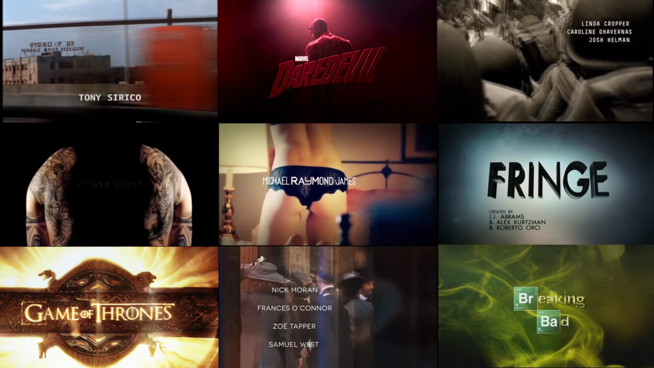
Anybody who has ever watched a TV show or a film will know of at least one title sequence. Many will recognize the first few seconds of the opening theme to the Simpsons. Just two seconds can be enough to brand an entire TV show. It’s phenomenal.
Although the theoretical essay is written below, it is highly suggested to follow the video as it offers real-time visual examples and tutorials on making your own title card and title sequence.
What Is A Title Sequence?
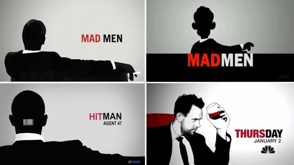
A title sequence is not just an intro to a TV show or a film to display credits. It is an opportunity to set the tone; you get to invite your audience into the fictional world and give them a taste. Title sequences can reinforce brand identity and provide instant recognition. The end section of Mad Men’s title sequence has now become its signature logo, and in turn, it has influenced popular culture with a series of imitations.
How Long Should A Title Sequence Be?
So the question remains: as a DIY or no-budget filmmaker, do you need a title sequence for your short film or web series? If you have a short, 15 minutes or under, you only have a limited amount of time to tell the story you want. Audiences can comprehend that a short film will not provide deep character depth or an immersive story that is found in 15 episodes of TV. They will, however, expect a quick entertainment fix and then move on to the next short video. Anything over 30 seconds, you’ll lose your audience fast.
On average, only 1.9% of a feature film’s length is designated to a title sequence. If we calculated that percentage into a 15-minute short, it would only be 1.8 seconds long. You can see that it doesn’t translate well. A title sequence is essentially a movie inside of a film, but you do not have a paying customer. If you want to work with a title sequence within your short, you will have to work quickly.
The Different Types of Title Sequences
Title Cards
In recent years, as TV has entered the so-called Golden Age, title sequences have often been replaced with a title card.
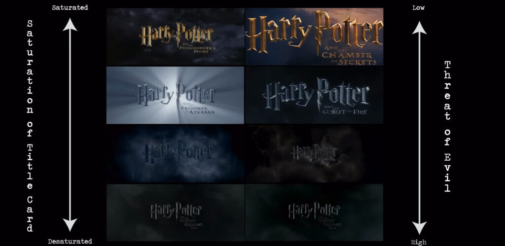
A title card usually lasts no longer than 12 seconds and will often just consist of the show’s logo and a brief sound clip. This will allow for a longer airing of the show, sometimes an extra minutes worth of story can make all the difference. A new device for the title card is to design the logo around the TV show and the current narrative theme within that season. Although this is also used within films, it is more common to find it on the small screen because of the progressive nature of television series.
In the IndieTips video, there’s a short tutorial that shows you how you can make your title card. Following this link will take you to 3:18 in the video, where the tutorial starts.
Montage Title Sequence
The most popular way of working with a title sequence is to have a montage of symbolic shots. If you are making a title sequence for a 15-minute web series, then a 25-second title sequence would be sufficient and help establish your show’s identity.
Montage title sequences often work best when you do not have a direct relation to the show itself. For example, the title sequence to True Blood and The Walking Dead do not feature the actors from the show, the locations and sets are loosely absent most core elements from the actual show itself are missing. Instead, we are often presented with a series of symbols and themes that will be present throughout the series or film. As mentioned before, a title sequence can be a movie within a movie. You can connect with your audience on an entirely different level. If you studied or are studying media in school, you would have often deconstructed visual imagery.
Analyzing True Blood’s Title Sequence
As an exercise, we will take 10 seconds (starting at 00:10) from the True Blood title sequence and see what we can learn about the series.
Instantly, we can see the series is set in rural America.
There’s a heightened sex sequence with full nudity; this is going to be an adult series with themes of sex.
The subject of religion is present. A church scene is juxtaposed to a rundown liquor store. This could indicate that characters in the show see religion as a concept in ruin. Or is it something people turn to when times are hard?
There is a civilian, a possible protester, being carried away by the police. He is outnumbered 6:1. Does this suggest that the bad guys will outnumber the main characters, or does this say that the establishment will not protect you? From what looks to be the same film roll, many white, middle-aged men look directly at us, the audience, as outsiders. Almost as if we are not welcome. It proposes the question: who is not welcome?
The period of the film stock looks like it’s from the civil rights era—a period where those of a different race fought for equality. Presumably, one would know from the trailers or show information that this show revolves around vampires. Does this implication mean that Vampires have to fight for their rights? We quickly see a few gravestones, which directly symbolize death. Then, finally, we are brought back to another clip with sexual associations, which reinforces the notion that, yes, this is an adult series with sexual themes.
If we look at the actual style of the sequence, it’s been processed to look like it was shot on an 8mm camera or old film stock—a lot of grain, light leaks, and film burns. Of course, this is a dated tool, so does this suggest that the geographical setting and people who reside there have dated ideologies. All of this was from just 10 seconds of footage. Is some of it a reach for a conclusion? Sure. However, that’s the point. The audience is given respectable media to look at and analyze.
To create your title sequence, you can find tips in the video at the starting point of 11:30. A title sequence does not just let the audience know who is in your film. They will be aware of that when they watch the show or film themselves. A title sequence is a moment of prosperity where you can invite your audience to a foreign world, and you will want to make sure that their first experience there will be amazing.
3D Logo Reveal
The third option, which has become popular over recent years, is the 3D logo reveal. Andrew Kramer of Video Copilot has an excellent tutorial on creating your own.
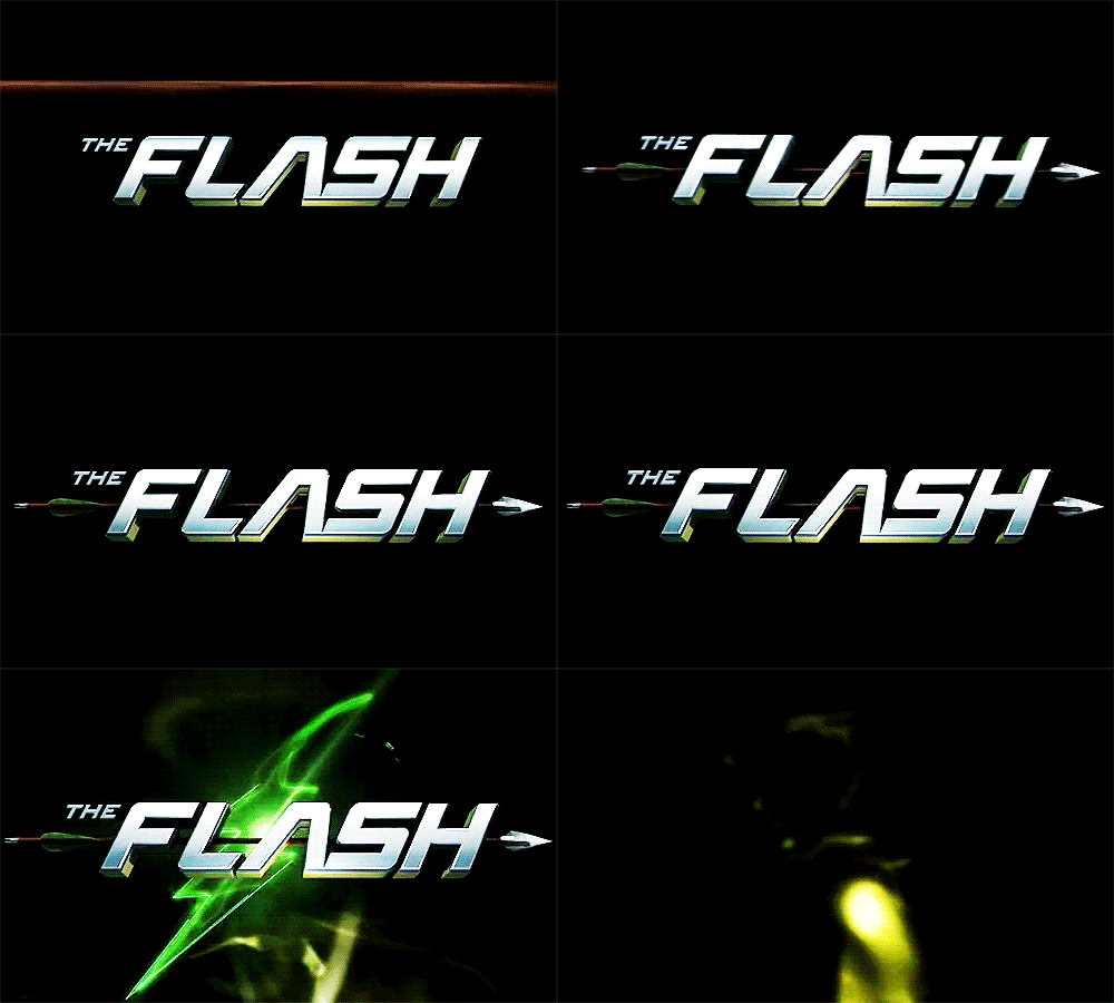
The 3D logo reveal is often used instead of the title sequence and plain text animation. In recent years, Television Networks have had much fun with 3D intros when an episode has a particular theme. For example, above is Arrow’s 3D logo, and below is the Flash’s.

Then, in season three, there was a crossover between the two shows, and the 3D logo was changed to represent that.
Remember to check out the video for the full breakdown and tutorial. If you have made a title sequence, post it in the comments below.

